
From our last post on customers learning you even exist, they’ve clicked through onto your website. Great news. There is a lot you can do to maximise what happens with your traffic or to make sure you even get traffic.
A website is only as good as the time and planning you put into it at the very start. We will look at the basics you need in place in order to get a customer from clicking on you in search results (or typing in your web address) to taking the action you want such as filling in a form or making an enquiry.
- Does it appear in search results?
- How quickly does it load?
- Is it mobile optimised?
- How does it look?
- Is it easy to navigate and find information?
- Does it look secure?
- Is there a call to action that works any time of day?
- Do you keep your website updated and fresh?

Does it appear in search results?
I’ve heard plenty of people say that they don’t get web traffic and that their website is a waste of time. They rely on business from other sources. Let’s consider this situation:
A person moves into town and decides to setup a restaurant. An Italian restaurant. The problem is, on the outside you can’t really tell what it is – the sign is quite small and doesn’t mention it’s an Italian restaurant. There is a menu displayed outside but there aren’t many terms that people are looking for – squashed dough with toppings (they’re looking for pizza). You look through the window and it’s hard to see what it is inside.

The text on your website needs planning. As you would research comparable properties for a Red Book Valuation, you need to research what customers are actually typing into Google. The phrases that customers search a lot in your area are the phrases that need to be consistently mentioned on pages of your website. Your homepage should mention the more general phrases of we are ‘building surveyors in [enter location]’ and so on. Dedicated pages for each of your survey types can then have a relevant keyword used a lot throughout it. For example – your page about Homebuyer Reports. If the phrase ‘RICS Homebuyer Report in [Location]’ is searched a lot in your area then use that around 10 times in your text. The text needs to read well and not clearly be an attempt to just force the phrase in there. This signals to Google your web page is relevant to search results and help your customers know this is the right place to be reading.
You can use tools such as Google Keyword Planner to find out what people are searching. Choose a keyword (or two) relevant to each page of your site and make sure you mention it a few times. Choose longer keywords than just ‘Homebuyer Report’ as everyone is using that and it will be harder to rank. Look for more specific ones that still have good search volumes. You can also use tools such as SEMRush who give you 10 free searches a day, to see how your website is performing and which keywords it is ranking for (if any).
Remember, the changes you make won’t provide instant results. This is a long-term strategy. It will take time for Google to realise you’ve changed your text and once it does to analyse if people reaching your page are engaging with it or leaving straight away (a signal it may not be relevant). To make sure they stay on your site you’ll need to work on the next factors…
How quickly does it load?
How many times have you clicked a link to a website, it takes a bit too long to load and so you just press back. We all do it. The truth is you have about 2-3 seconds for your site to load before you’ve more than likely lost an opportunity.
47% of consumers expect websites to load in two seconds or less. And 40% will abandon a page that takes three or more seconds. A one-second delay in page load time yields:
11% fewer page views
16% decrease in customer satisfaction
7% loss in conversions
(CrazyEgg)
There are a number of ways you can improve this yourself. If you aren’t sure what you are doing with your website then there are a number of easy ways your developer can speed your site up.
Image size: make sure the file size of an image is no bigger than it needs to be. From a few kb to 300kb max. If you’re images are all a few MB in size then you’ll be dramatically increasing loading times.
Plugins: remove plugins you aren’t using. They just add a security risk if not kept up-to-date and are more things for your site to load. You can also install speed plugins for sites built on WordPress that help to do all the technical work of speeding your site up.
Want to see how fast your different web pages are? Use Google’s page speed insights tool now.
Is your website mobile optimised?
You might spend most of your time viewing websites from your desktop as you write up reports. But mobile accounts for approximately half of web traffic worldwide. In the fourth quarter of 2019, mobile devices (excluding tablets) generated 52.6 percent of global website traffic, consistently hovering around the 50 percent mark since the beginning of 2017 (Statista 2020).
Making sure your site adjust to different screen sizes is no longer optional (it hasn’t been for a while). Not only will it make navigating your website hard for users if it doesn’t correctly adapt, Google will drop you down its search engine rankings. In both cases, you’re losing traffic from your sales funnel.
How does your surveying website it look?
I’m not asking if it has won awards, or if it’s a style of website I like. But it has to look clean, simple and modern. Put yourself back on a high-street. You walk past two restaurants. One looks clean, has a simply laid out menu outside and is nicely decorated. The other looks like it has seen better days. Which one do you walk into?

Same for your website. A dated website leaves customers feeling two things:
- Perhaps business isn’t going so well
- That the report they will receive will be equally difficult to read / follow
Customers do not want to spend time working out which surveys you offer, where you offer them or what’s unique about your service. It’s your job to make this quick and easy. Most people also click off old looking websites. Take time to choose great looking images – these make a huge difference to a look and feel of a site as does a nice font and brand colours. Really plan how to space everything out and how your users should flow through your site.
Is it easy to navigate and find information?
So, is your site easy to navigate. Your homepage should be broken down into clear sections making it easy to immediately identify where to navigate next to answer my question. Am I looking at residential or commercial services? Where can I find information about a specific survey type?
Customers make a decision about a website in 10 – 15 seconds. After they decide it looks ok, they need to know where to go. Too hard to work it out, they’re gone.
Don’t just decide it is easy to navigate because you understand where everything is. Test, test, test. Get your friends and family (the honest ones!) to take a look. Watch them use it and see how easily they find the specific survey you ask them to learn about… without any hints!
Where you see people struggling to follow your site, use this to understand where to put your call-to-action buttons – the ones throughout your page that encourage a web visitor to read more on another page, fill in a form or go to the contact page. Whatever you desired outcome is, you need to guide users clearly on that path.

Does it look secure?
You’ve got a customer to read a few pages on your site and now you want them to enquire. Two key factors here:
- Does your site look secure? You should have an active SSL certificate (the padlock sign next to the web address in the browser). Google also ranks sites lower that don’t have them. An SSL certificate stands for Secure Sockets Layer and it is a standard security technology for establishing an encrypted link between a server and a client to ensure data is kept secure. If a site doesn’t look secure, many customers won’t enter and submit their personal information.
- Are your forms simple and user friendly? If they don’t look appealing, are far too long and don’t work nicely on mobile you can guarantee many customers just won’t fill it in.
Do you keep your website updated and fresh?
I don’t mean constantly updating images and text, although keywords that customers search do change over time so it’s worth checking this every few months.
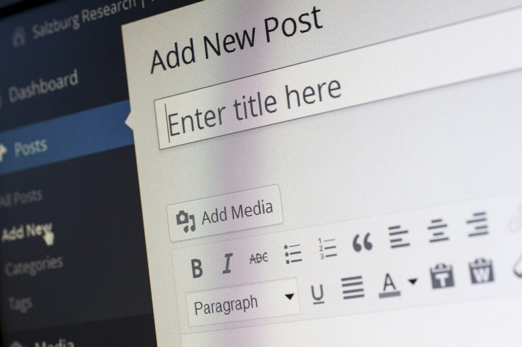
I’m focusing on blog posts. They don’t need to be long but these can be great if you post about interesting topics you see whilst you’re out visiting houses or the common pitfalls missed in surveys.
For example, ‘Common chimney issues found in Lancaster houses during Building Surveys’ – add in a few photos showing interesting finds and relevant keywords and you have a post that might start making it up the Google results pages and generate some traffic. If nothing else, it shows potential customers that you know what you’re talking about when they’re on your site and it shows you really are still in business.
Analyse Your Success
Changes to your website such as editing keywords (SEO – search engine optimisation) take time to filter through to Google. It can take around 2 months to start seeing the benefits. For changes such as website layouts and adding clear call-to-actions this will have an immediate impact on how website visitors interact with your site.
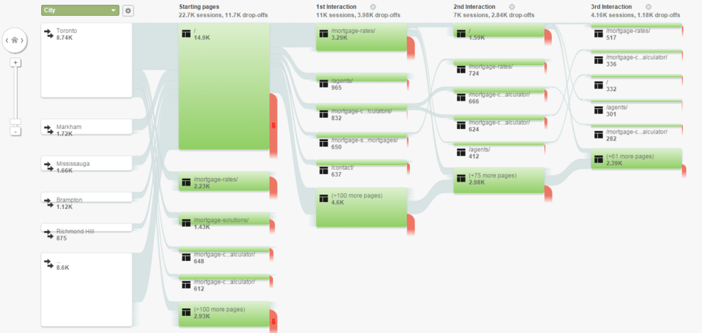
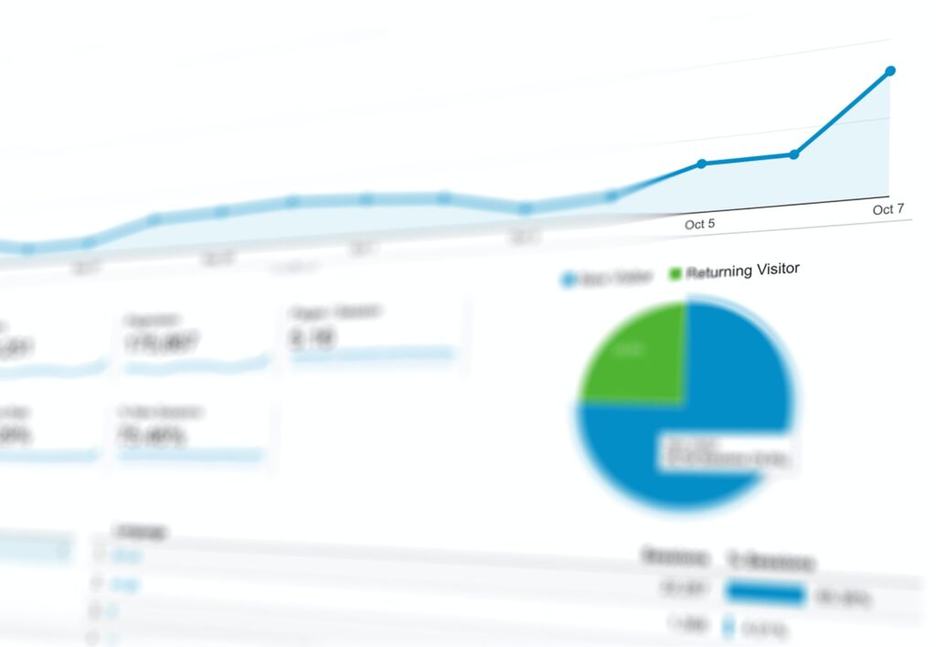
By adding a Google Analytics tracking code to your site you can track, for free, how many visitors you are getting, where it is from, how many pages are viewed, how long they stay on your site and more. This allows you to see if the changes you have made are working or if there are other changes that would help. The most interesting report is the user behaviour – seeing which page users started on, where they went next and where they drop off. If it’s on the contact page, great! If not, you can use this information to see which pages might need more work.
Summary
Take time to review your website and get the opinions of third parties. Look at your website analytics to see if it is performing or not.
Then make a plan to help you improve your site so it is favoured by both customers and Google. There are big opportunities to win sales online. Type in the keywords that the keyword planner shows customers are searching and see what the top ranking websites are doing. How are they laid out, how clear is their text. If you can do a better job, there is nothing stopping your site appearing first in your area.