
You’ve gone to all the effort of finding out what the customer wants to know from their report, you’ve spent time going through the property in-depth and you’ve invested time writing up all your findings for your customer to read through at their leisure.
You\’ve added:
- Photos with annotations
- Ratings or traffic light ratings
- Descriptions of the issue
- Different sections to break the report up
- You might even have added links to videos that help describe or show the issue
But a report with tens of pages can still seem daunting to many people to read through. People with focus or attention issues can have issues focusing on reading and therefore taking your report in (or even your terms if they are small font and lengthy!).
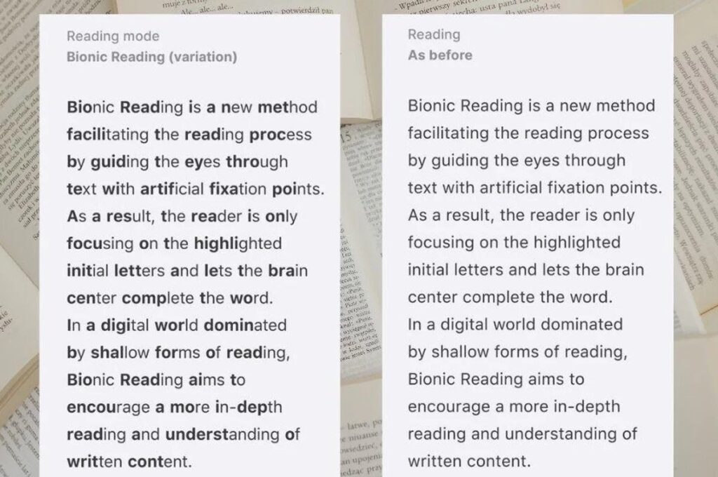
Bionic Reading font
It may sound gimmicky from the title. But have you ever considered using a different font? We discussed in a previous post about using the dyslexie font for customers who struggle with dyslexia. This isn\’t a new idea but more options like this are coming to market that can help customers engage with you in a different way.
The bionic reading font allows you to make the start of the word bold which helps to speed up the processing of the words to make reading easier and faster. If you don’t find it helps it\’s not designed for you but it could really help potential customers.
We’ve discussed using this in your report, but you could consider other times people must read your content:
- Emails
- Terms of engagement
- Blog posts
- Your website
What do the creators say? The creators of Bionic Reading claim that it is possible with their font tool to read more quickly and retain information better: \”Bionic Reading revises texts so that the most concise parts of words are highlighted,” the Swiss company’s website reads. “This guides the eye over the text and the brain remembers previously learned words more quickly.”
What else can you do?
It\’s always worth going back to your reports and considering how easy are they to follow?
Are they over 100+ pages? Can you simplify anything?
Are they text heavy? Could a picture paint a thousand words?
Are you describing something complex? Could a video be embedded or linked to?
What is the font like? Is it small and hard to read?
Layout – we’ve discussed this on our podcast. The same information presented differently can make a massive difference.
When did you last present a report to friends and family to provide their feedback on? Small changes to how you present your terms documents, emails and reports for different users makes a huge difference to how customers engage with them. It\’s important to regularly get feedback to make sure your communication and reports say what they need in a clear, easy, quick manner and is what makes the difference between a 4* service and a 5* service.
Try out their free converter today: https://app.bionic-reading.com/
Making your survey and valuation reports more engaging
You’ve gone to all the effort of finding out what the customer wants to know from their report, you’ve spent time going through the property in–depth and you’ve invested time writing up all your findings for your customer to read through at their leisure.
You’ve added:
- Photos with annotations
- Ratings or traffic light ratings
- Descriptions of the issue
- Different sections to break the report up
- You might even have added links to videos that help describe or show the issue
But a report with tens of pages can still seem daunting to many people to read through. People with focus or attention issues can have issues focusing on reading and therefore taking your report in (or even your terms if they are small font and lengthy!).
Bionic Reading font
It may sound gimmicky from the title. But have you ever considered using a different font? We discussed in a previous post about using the dyslexie font for customers who struggle with dyslexia. This isn’t a new idea but more options like this are coming to market that can help customers engage with you in a different way.
The bionic reading font allows you to make the start of the word bold which helps to speed up the processing of the words to make reading easier and faster. If you don’t find it helps it’s not designed for you but it could really help potential customers.
We’ve discussed using this in your report, but you could consider other times people must read your content:
- Emails
- Terms of engagement
- Blog posts
- Your website
What do the creators say?
The creators of Bionic Reading claim that it is possible with their font tool to read more quickly and retain information better: “Bionic Reading revises texts so that the most concise parts of words are highlighted,” the Swiss company’s website reads. “This guides the eye over the text and the brain remembers previously learned words more quickly.”
What else can you do?
It’s always worth going back to your reports and considering how easy are they to follow?
Are they over 100+ pages? Can you simplify anything?
Are they text heavy? Could a picture paint a thousand words?
Are you describing something complex? Could a video be embedded or linked to?
What is the font like? Is it small and hard to read?
Layout – we’ve discussed this on our podcast. The same information presented differently can make a massive difference.